Visualizing vDEM democracy scores using plotly…
… and relying on R and Python scripts while doing it
Plotly is a browser-based interactive graphing library available both for Python and R usage. It is ridiculously easy to use, and it outputs insanely beautiful visuals. So much so that you’re always tempted to use it for any type of plotting. I’m using this short blog-post to exploit the beauty and practicality of plotly.
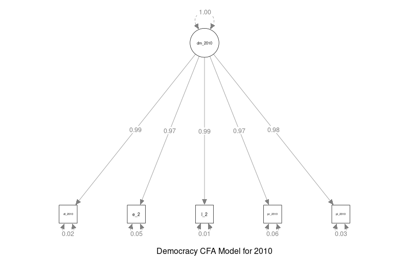
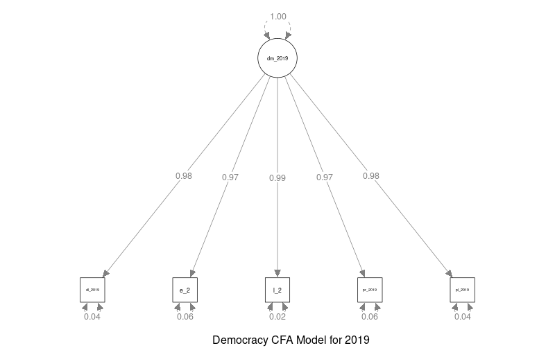
I got vDEM data, filtered it to the 2010-2019 period, and used the five high-level-democracy-indices to come up with an overall democracy score for each country. I’m not sure if the theoretical construct and the measurement model make sense. Though, I guess not a lot of democratization scholars would want to murder me for it. The idea is simple: the country’s overall democracy level/score is influencing the high-level-democracy-index scores. In other words, the latent construct is influencing five measures – namely, deliberative democracy, egalitarian democracy, liberal democracy, participatory democracy, and electoral democracy. Below are two example CFAs for the year 2010 …

… and 2019.

The goodness of fit stats yields to pretty good values except for the RMSEA, which is basically yelling at my face… But who cares… The point is not the theoretical measurement model; the point is plotly’s beauty and practicality.
Below is how democracy thingies look like between 2010-2019. Mingle with the interactivity of the map all you want, and enjoy the cutie pie of plotly.
If you want to replicate this, just head to this repo of mine. Download the R and Python scripts and run them in the terminal in this order. Also, make sure you download the geo_data folder as well and have it in the working directory. Easy, peasy. Have fun looking at the overall deteriorating democracy in the world!!!
Thanks to Paul Wlodkowski for his super helpful tutorial. Paul had downloaded the publicly available GIS data from Natural Earth at https://www.naturalearthdata.com/downloads/110m-cultural-vectors.
One last thing: if you don’t see the world map in the iframe above (then it must feel ridiculous to read the blog-post), make sure your browser is javascript enabled and supports embedded frames for HTML. In any case, the HTML file is here.